When you look at the magazine or newspaper, the messages on the words and images are the major things. Designers not only deal with visual elements but also have to consider the readability. Therefore, foreground and background need a good integration. Because the background will effectively influence the vision of reader. In the same way, the rest space is as important as text and image.
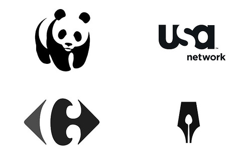
White space is often referred to as negative space in graphic design. In fact, there are many logos that applied negative space in design, such as WWF, USA Network, Carrefour, Guild of Food Writers logo. It can be seen that they all present an interested secret and connect with the surroundings.
White space is often referred to as negative space in graphic design. In fact, there are many logos that applied negative space in design, such as WWF, USA Network, Carrefour, Guild of Food Writers logo. It can be seen that they all present an interested secret and connect with the surroundings.

Images from Logo Design Love
According to John Maeda said on Laws of Simplicity,
The opportunity lost by increasing the amount of blank space is gained back with enhanced attention on what remains. More white space means that less information is presented. In turn, proportionately more attention shall be paid to that which is made less available. When there is less, we appreciate everything much more.It means negative space can lead the audience to give more notice on logo. In visual psychology, Kanizsa triangle also uses the characteristics of human vision to attach the background. People can recognize the shape without the line.

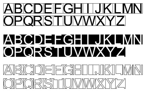
In addition, I do an exercise to testify the negative space in typeface. The typeface is Arial font. Because Arial font is one of common font now. Firstly, putting the font into square and using the background to illustrate the letter.

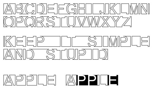
Then, it can be seen that the black background look like white letter in black background. I use the white background with black line to make the word. In addition, cooperating two ways at one word to see the result.

Although the letters lack some lines, the audience still can base on the shape to see the letter. Designers can use this advantage to create any outline for their concept. Additionally, negative space in logo design shows the simplicity and gives the audience to see a symbol in two ways.
Logo design is the trade mark of any company but how you define Media Logo
回覆刪除I am not quite sure what you mean by Media Logo. In my opinion, media logo is more adoptive and flexible. As you can see on MIT Media Lab logo, it shows the spirits of MIT lab and diversity. But logo gradually lost its original meanings nowadays. It become an eye candy to attract audience. Therefore, the boundary of media logo is important to verify. I hope this could help you. Thank you for the comment.
刪除