2011/04/08

White Space

When you look at the magazine or newspaper, the messages on the words and images are the major things. Designers not only deal with visual elements but also have to consider the readability. Therefore, foreground and background need a good integration. Because the background will effectively influence the vision of reader. In the same way, the rest space is as important as text and image.

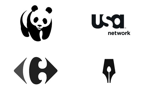
White space is often referred to as negative space in graphic design. In fact, there are many logos that applied negative space in design, such as WWF, USA Network, Carrefour, Guild of Food Writers logo. It can be seen that they all present an interested secret and connect with the surroundings.

White space_1
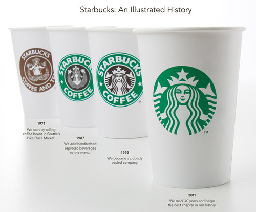
Images from Logo Design Love

According to John Maeda said on Laws of Simplicity,
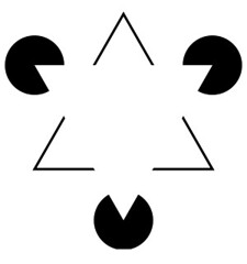
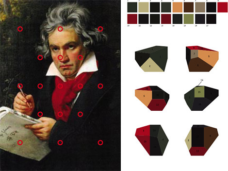
The opportunity lost by increasing the amount of blank space is gained back with enhanced attention on what remains. More white space means that less information is presented. In turn, proportionately more attention shall be paid to that which is made less available. When there is less, we appreciate everything much more.
It means negative space can lead the audience to give more notice on logo. In visual psychology, Kanizsa triangle also uses the characteristics of human vision to attach the background. People can recognize the shape without the line.

White space_2

In addition, I do an exercise to testify the negative space in typeface. The typeface is Arial font. Because Arial font is one of common font now. Firstly, putting the font into square and using the background to illustrate the letter.

White space_3

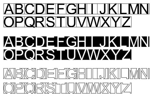
Then, it can be seen that the black background look like white letter in black background. I use the white background with black line to make the word. In addition, cooperating two ways at one word to see the result.

White space_4

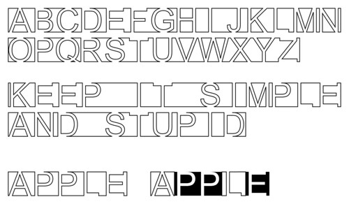
Although the letters lack some lines, the audience still can base on the shape to see the letter. Designers can use this advantage to create any outline for their concept. Additionally, negative space in logo design shows the simplicity and gives the audience to see a symbol in two ways.

2011/04/01

Brand Nickname

The word “brand” is derived from the Old Norse brandr meaning “to burn.” In order to identify, the owner make an animal with unique symbol at a later date. Nowadays, brand presents the reputation of a company. Furthermore, it has developed a relationship between the audience and corporation. Brand can show social status and personality. In fact, it already integrates into our normal life. For instance, the situation can be seen on the short film “Logorama." People also try to give the nickname for a company. It could be referred to the original name or the product. For instance, the Volkswagen Beetle is called “bug” or “buggy.”

According to Kevin Roberts said on the book “Lovemarks”,
They forget all about the intimate dimension of relationships. They loved Customer Relationship Management. They honed their skills assessing the benefits from sponsorships, entertainment partnerships, and al l the other "ships." But if you attempted to get up close ...they dashed to the other side of the boardroom table. They ignored the power of Intimacy. They neglected to look at the intimate responses that illuminate the great Lovemarks.
Therefore, it is not a bad thing for the corporation. When someone gives you a nickname, it means they want to have an affiliation with you. Then, the audience does the same thing to their favorite brands. The company also redesigned logos in order to adopt nicknames. For instance, “FedEx” comes from Federal Express.

Brand Nickname_1

Many companies don’t only change their name for the intimacy. Additionally, the nickname is easy to keep in mind. It usually uses the initials for substitution, such as HP, HBO, P&G and AT&T.

Brand Nickname_2
Brand Nickname_3

There is a quotation below by William Bernbach.
Nobody counts the number of ads you run;
they just remember the impression you make.
In the same way, the audience will not remember the full name of company at first sight. If the company uses the nickname, the state of affairs will be different. Therefore, the audiences are very important for a company. They reflect the problems and help the corporation adjust for a better condition.

Further information:
You Took My Name by DOROTHY - Can you name all the brands?

2011/03/26

[Book] Simplicity

[Book]Simplicity_1

Edward de Bono (born 19 May 1933, in Malta) is a physician, author, inventor, and consultant. He thought that the major problems in thinking are perceptual. There were many mistakes which quickly jump to the wrong conclusion. Therefore, he made a term which is lateral thinking. In addition, he continued to invent many ways of creative thinking. Nowadays, the six thinking hats already is a thinking tool in schools.


From the book “Simplicity”, he shows different kinds of thinking ways about simplicity. For instance, he uses another way of thinking to express how make things simple and practical.
If you have to learn a sequence of ABCD you would usually learn A first and then B and then C and then D. This means that you are always moving from an area you know very well to an area you do not know. The chances of making a diversion or a mistake are very high. Much learning time is spent unlearning mistakes.

When you learn backwards, you learn D first and then C and then B and finally A. In this way you are always moving forward into an area you already know.
Furthermore, he points out the major use for thinking. It shows the purpose of simplicity.
The major use for thinking is not in problem solving but in improving what we are doing and finding new things to do.
In order to convey the simplicity, he also invented a simple game which called the L Game.
It is a social justice game because you cannot win by winning.
If you try too hard to win you lose.
In addition, there are 14 formal methods of lateral thinking introduced in this book. In my opinion, every method is very useful for understanding the simplicity. “Historical Review” let the user to think about the necessity of object at the beginning of process. “Modules and Smaller Units” presents the organization are built by small units. It could be simpler for repair. In other way, the thing is more complicated than before.

Finally, he talked about the simple life. Everyone should understand the values, priorities and considerations to control the complicity in our life. In last chapter, he gives the ten rules of simplicity to remind the readers.

Further information:
Edward de Bono - discusses his Simplicity workshop

2011/03/18

The Future

The future_1

How many compositions can one logo have? There are 40,000 logo shapes in 12 different color combinations for MIT Media Lab's New Logo. In order to celebrate the 25th anniversary, two Brooklyn-based designers, E Roon Kang and Richard The, created an innovative logo for MIT Media Lab.

From the article on Co.design
The basic idea here is that the logo has three intersecting spotlights that can be organized in any of 40,000 shapes and 12 color combinations using a custom algorithm. The spotlights tip a hat to the Media Lab’s rakish spirit of cross-pollination, with each spotlight symbolizing a single individual.

MIT Media Lab Identity, 2011 from readyletsgo on Vimeo.

The algorithmic design produces a unique logo for every teacher, staff member and student. In addition, it can give each new student a fresh logo for the next 25 years. The logo is just like the social security number.

Furthermore, Stefan Sagmeister created the logo of Casa da Musica in 2007. The Casa da Musica, a concert hall in Portugal, was built by Rem Koolhaas in 2005. Stefan Sagmeister used every aspect of the architecture as its corporate identity. In addition, his friend invented the software to make the logo flexible.

The future_3

According to Stefan Sagmeister talked on TED,
The Casa da Musica logo generator which scans any image and transfers the colours of this image onto the logo to create an individual colour logo version that has the same colour information as the given image. So the logo changes constantly its colour spectrum to present certain events or people of the Casa da Musica.
The future_3

In this way, every event in Casa da Musica can have their special poster. Furthermore, the logo can really incorporate with different kinds of media. For instance, the logo can grow under the skin.

The future_4

In fact, these two logos all based on a big frame and created an individual identity. MIT Media Lab's Logo shows a large number of arrangements by changing the color and position. Additionally, the Casa da Musica logo has more variations on the texture. The frame presents the corporate and brand value has different meaning.

It changed the former way of thinking in branding. The logos really become a part of their audience. In this way, the brand will effectively have an emotional relationship with their audience. Applying new media and technology creates an innovative prospect for the future. Although the concepts are just a beginning now, I still can see the unlimited possibility from these logos.

Further information:
Pentagram's Luke Hayman on How Multimedia Is Transforming Branding

2011/03/11

Taiwan Tourism New logo

Taiwan, a lovely place, has different kinds of food and friendly people. It contains enriched cultural and recreational activities. In the 16th century the Portuguese vessels at sea through Taiwan, the sailor saw Taiwan from the sea and shouted "Ilha Formosa!” It means “Beautiful Island”. Taiwan is a small island situated in East Asia in the Western Pacific Ocean and located off the southeastern coast of mainland China. It has the advantage of location for the travelers. Taiwan reportedly had 5 million visitors last year.

From the press release on Taiwan Tourism Bureau,
Tourism will become a vehicle for driving the development of a variety of new industries such as health care, agriculture, and green industries, giving them a channel for transforming their resources into tourism products.
Therefore, the Taiwan Tourism Bureau introduced a new identity designed by London-based Winkreative in 2011. According to the article on the official website,
The new “Taiwan – The Heart of Asia” logo is succinct, and consists of a newly created typeface. It represents the sincerity and innovation of Taiwan’s communications with the world. Taiwan is a fusion of tradition with new trends. Its special characteristics and diversity present what is precisely a microcosm of Asia. Asia’s heart and Taiwan’s warmth are what Taiwan tourism wants to offer tourists from around the world.
Taiwan Tourism New logo_1
Image from Brand New

Then, the brush calligraphic strokes change to a newly created typeface. It seems to be lack of energy and becomes another western brand. The blended orange color might want to imply the warmth. But the former color is much easier to show the variety of Taiwan. Furthermore, the whole logo can’t strongly feel the meaning of the slogan “Taiwan - The Heart of Asia.”

Wally Olins said in Branding the Nation - the historical context,
Rebranding is OK for a corporation but not for a nation. In other words corporations change, merge, divest, invest and rebrand and reinvent themselves but nations don’t change, they are immutable. Their verities are eternal.
In my opinion, it doesn’t mean rebranding a nation is forbidden. When the brand connects with nation, it must be careful to manipulate this image. Because it attaches with the culture. In addition, the former logo was promoted for ten years. The impression was already built on every tourist’s mind.

Finally, this is a clip by D1 Production from Malaysia. You can see the beauty of Taiwan from a foreigner and testify the new logo is good or not.

PassionRepublic Taiwan Trip from D1 PRODUCTION on Vimeo.

2011/03/04

[Book] The Laws of Simplicity

[Book] The Laws of Simplicity_1

John Maeda is a Japanese-American graphic designer, computer scientist and author, grew up in a tofu factory in Seattle. He is the current President of the Rhode Island School of Design, At RISD. John Maeda also is a MIT Media Lab.'s professor (director of the aesthetics + computation group). People who are interested in digital art design must have heard that John Maeda is the pioneer of digital art and design.

The Laws of Simplicity which are written by John Maeda has ten laws and three keys. In the book, he used different kind of examples to explain each law. For example, he used the sushi master and the refund policy to testify Law 8 Trust. At the beginning, the reason he wrote this book is according as two words, simplicity and complexity. They both have three letters, M I T. This evidence convinces him to advocate "simplicity” and balance the "complexity".

Each law in the book is generally independent and can be used together. There are three sets, which are 1 to 3, 4 to 6 and 7 to 9. You also can find that John Maeda apply the law in his book. For example, he suggested that the reader can read 1 to 3 and then skip to Law 10. Because Law 3 is talking about Time.

So, what is simplicity? In the area of architecture, there is a theory called minimalism. Less is more. The beauty of building is generated in the contact of light and shadow. In technology, simplicity sells in High-Tech gadgets. Products not only have high performance but also need to use easily. In graphic design, simplicity is important for a logo. A simple logo design is easy to remember and recollect for an audience. It can easily catch the attention of a target customer towards product or the advertisement or the company itself.

On the lecture in TED, George Whitesides: Toward a science of simplicity

He talks about complexity have different layers of simplicity. On the other way, Simple idea contains complex process. Finally, he adduces two quotations to explain the simplicity.

Make everything as simple as possible, but not simpler. - Albert Einstein

Perfection is achieved, not when there is nothing more to add, but when there is nothing left to take away. - Antoine de Saint-Exupery French writer (1900 - 1944)

On the lecture in TED, Eric Berlow: How complexity leads to simplicity

He said that the more you can zoom out and embrace complexity, the better chance you have of zooming on the simple details that matter most.

Everyone has their thought about simplicity. For John Maeda, he thinks simplicity is life. In my opinion, I think simplicity is complexity. So, what is simplicity for you? Hope you can share your opinion with me.

Further information:

The Laws of Simplicity - website
John Maeda on the simple life - TED Talk

2011/02/25

Our Community


This lecture is about a vision for sustainable restaurants by Arthur Potts Dawson. He talked about how much food, water and energy can be wasted in our normal life. In this lecture, you can see the ideas to practice on his own restaurants. This is an excellent prospect about creating recycling, composting, sustainable engines for good.

Our Community_1

In 2010, he started new co-operative supermarket in the London Borough of Camden, inspired by the Park Slope Food Coop in Brooklyn, New York. Its name is The People’s Supermarket. The concept is “for the people, by the people.” The members in this supermarket have to work four hours volunteer time per month and obtain a discount on their each time shopping. It looks like a small ecosphere and create a best benefit for the local residents.

From the website of The People’s Supermarket, you can see the Brand Value.
The Supermarket is a sustainable food cooperative that responds to the needs of the local community and provides healthy, local food at reasonable prices. To this end, we believe in a series of key values, which guide our philosophy and management approach.
The visual identity contains the reason that the supermarket is not-for-profit and production budgets are consistently low. Unreal, a London based branding and advertising agency, use the ‘Euroslot’ as a symbol of The People’s Supermarket.

Our Community_2

From the article on Identity Designed
The slot can be easily cut through anything from letterheads to in-store packaging, creating a simple, clever and cost-effective branding device that can be consistently applied across all communications.
Our Community_3

The colors that they choose are black and yellow. The audience can obviously see the brand. The staff can simply make the posters with low-cost. In addition, you also can find some color similarity on Selfridges' yellow shopping bag.

Finally, The People’s Supermarket has a series of documentary on Chanel 4. You can see many problems at the beginning of a brand. For instance, the customers consider the afforded price. Besides, it can be found how to create and sustain a really co-operative community.

2011/02/18

A Small Idea in Big Scale

A small idea in big scale_1

Every year in January, the Annual Meeting of the World Economic Forum holds in Davos-Klosters which is best known to the world at large simply as "Davos". There are many leaders in the world participate this important event. On the security check-in area of the main event , there is a new installation worked by The Partners.

The concept is based on the client, Deloitte. From the statement on the article, World Anamorphic Branding,
Titled ‘A new perspective can change everything’ a Deloitte message ‘Stay a step ahead’ was woven into a broader story, encapsulating the forward thinking ambition of Davos and the World Economic Forum as an organisation.
When you go through this pathway, you can see the change of typeface from the beginning and feel different atmosphere. The brand shows the interaction with their audience. They use the anamorphic expression to connect the whole space. This is a small idea in big scale. According to Russ's talking,
What was it like creating a 440m² anamorphic installation your client and prime minister would be walking through? Alas to say it was pretty interesting.

Davos anamorphic from The Partners on Vimeo.

Everyone has different perspectives to look at this world. If you change the angle of your view, a normal thing can be more attractive. This is the sculpture made by Ron Mueck. He never made life-size sculptures because it never seemed to be interesting. In this way, people will start to observe the detail of the sculptures.

A small idea in big scale_2

Furthermore, the anamorphic art makes visual sense only when viewed from a particular angle or with the use of a viewing device such as a mirror.

A small idea in big scale_3

2011/02/08

True or False

A new report released from the International Chamber of Commerce (ICC) specifies that the global economic and social impacts of counterfeiting and piracy will reach US$1.7 trillion by 2015 and put 2.5 million legitimate jobs at risk each year.

It means that creative industries may not have enough funds to operate and more people spend money on counterfeit products. In addition, people will be unemployed in the future. The company has bad reputation on their products.

A brand for a company is like a reputation for a person.
You earn reputation by trying to do hard things well. - Jeff Bezos

Why customers are willing to buy counterfeit products? Because it is cheaper than the original. Furthermore, people need Brand Value to prove his status, especially luxury brand. First image determines by their appearance. It concerns the feelings of a person.

According to Gaurav Bahirvani (Counterfeit Branding - Representing True Globalization!) said
Consumers are often unaware that they buy products that resemble what they want. This is worrying companies because fake products often ride on the success of the original product, eating into sales, and, in some cases, harming the consumer.
True or False_1

On the other hand, low price leads to low quality. It is extremely danger for some products, such as medicine, food and electricity. You never know when your cell phone will be exploded. Therefore, the counterfeit products might not the best choice.

2011/02/07

Logorama

Logorama from Human Music & Sound Design on Vimeo.

What if the logo doesn’t have to promote by advertisement or marketing strategy. They just like a human being have personality. Logorama, written and directed by H5 / Francois Alaux, Hervé de Crecy and Ludovic Houplain. It won a Best Animated Short Oscar. Logorama builds a beautiful world with more than 3000 well-known logos.

The story set up two Michelin tire brand names play in the police, driving a black "Chevrolet" trademark for the police car, try to arrest the fugitive Ronald McDonald. They cleverly arranged a variety of brands in the film. For instance, Benley and Astonmartin were used their trademark as the birds. It is astonishing that there are so many brands in the world. These brands have significant influence on our life. The interaction between these brands might present the competition in the market place. The disaster in the later stage also shows the horrible consequence of destructive competition.

There is an interesting thing. More than 3000 companies by the use of trademarks did not have objection or opposition to the H5. There is only a company called Cash Converter sent an email to H5. Because their own company logo placed in a prominent position in the animation.

Similarly, there is a film called Font Conference. It produced by College Humor. The story is about a debate on whether to allow Zapf Dingbats to join the conference. Ransom interrupts with a dire threat to Courier and Curlz MT. Although the film is hilarious, each person appears their own character based on the font.

Brand Recognition

Brand Recognition_1

In 2011, Howard S., Starbucks chairman, announces the Starbucks’ New logo on January 05. The new logo will be launched at their 40th anniversary. The design of new logo keeps the Siren and takes the logotype away.

From the statement on the offical website,
Our new brand identity will give us the freedom and flexibility to explore innovations and new channels of distribution that will keep us in step with our current customers and build strong connections with new customers.
It can be found that Starbucks not only sell the coffee but also want to advance different parts of our life.


Although Starbucks prospects for next chapter, there still are many disagreements on the internet after the statement. Some people also laugh at the new logo by predicting the evaluation of Starbucks logo. Many people still prefer the old logo in 1992.

Brand Recognition_2

In fact, did this change really affect their target audience? People that always buy a cup of Starbucks coffee still choose it as his first option. They might just complaint the design of new logo.

Howard S. also indicates three points.
- A unique retail experience that creates a Third Place for our customers between their homes and places of work.
- A carefully crafted offering of the finest, high-quality coffees from around the world.
- The emotional connection that our partners make daily with our customers.
Brand recognition already like a seed grow on every one‘s mind. The image of Siren recalls the customers’ experience. In the other way, GAP seems to make wrong decisions about its new logo. “It looks like the emblem of some failed low-fare spinoff of a major airline,” wrote Slate’s Tom Scocca. Eventually, the new logo only lasts for one week. The company changes their mind to return to their iconic blue box logo.

Brand Recognition_3

Additional Information _ Brand Recognition

Brand Recognition is the extent to which a brand is recognized for stated brand attributes or communications. In some cases brand recognition is defined as aided recall - and as a subset of brand recall. Logo and tagline testing can be seen as a form of brand recognition testing. For example, if a product name can be associated with a certain tagline, logo or attribute (safety and Volvo; "Just do it" - Nike) a certain level of brand recognition is present.