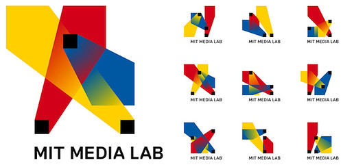
How many compositions can one logo have? There are 40,000 logo shapes in 12 different color combinations for MIT Media Lab's New Logo. In order to celebrate the 25th anniversary, two Brooklyn-based designers, E Roon Kang and Richard The, created an innovative logo for MIT Media Lab.
From the article on Co.design
From the article on Co.design
The basic idea here is that the logo has three intersecting spotlights that can be organized in any of 40,000 shapes and 12 color combinations using a custom algorithm. The spotlights tip a hat to the Media Lab’s rakish spirit of cross-pollination, with each spotlight symbolizing a single individual.
MIT Media Lab Identity, 2011 from readyletsgo on Vimeo.
The algorithmic design produces a unique logo for every teacher, staff member and student. In addition, it can give each new student a fresh logo for the next 25 years. The logo is just like the social security number.
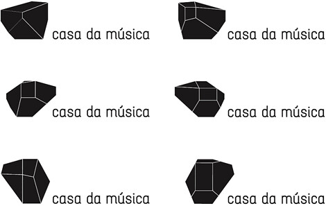
Furthermore, Stefan Sagmeister created the logo of Casa da Musica in 2007. The Casa da Musica, a concert hall in Portugal, was built by Rem Koolhaas in 2005. Stefan Sagmeister used every aspect of the architecture as its corporate identity. In addition, his friend invented the software to make the logo flexible.
Furthermore, Stefan Sagmeister created the logo of Casa da Musica in 2007. The Casa da Musica, a concert hall in Portugal, was built by Rem Koolhaas in 2005. Stefan Sagmeister used every aspect of the architecture as its corporate identity. In addition, his friend invented the software to make the logo flexible.
According to Stefan Sagmeister talked on TED,
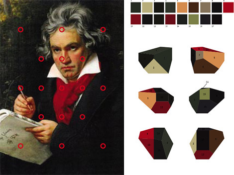
The Casa da Musica logo generator which scans any image and transfers the colours of this image onto the logo to create an individual colour logo version that has the same colour information as the given image. So the logo changes constantly its colour spectrum to present certain events or people of the Casa da Musica.
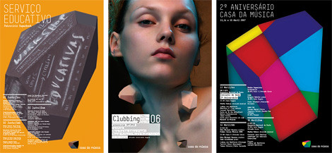
In this way, every event in Casa da Musica can have their special poster. Furthermore, the logo can really incorporate with different kinds of media. For instance, the logo can grow under the skin.
In fact, these two logos all based on a big frame and created an individual identity. MIT Media Lab's Logo shows a large number of arrangements by changing the color and position. Additionally, the Casa da Musica logo has more variations on the texture. The frame presents the corporate and brand value has different meaning.
It changed the former way of thinking in branding. The logos really become a part of their audience. In this way, the brand will effectively have an emotional relationship with their audience. Applying new media and technology creates an innovative prospect for the future. Although the concepts are just a beginning now, I still can see the unlimited possibility from these logos.
It changed the former way of thinking in branding. The logos really become a part of their audience. In this way, the brand will effectively have an emotional relationship with their audience. Applying new media and technology creates an innovative prospect for the future. Although the concepts are just a beginning now, I still can see the unlimited possibility from these logos.
Further information:
Pentagram's Luke Hayman on How Multimedia Is Transforming Branding
沒有留言:
張貼留言