Taiwan, a lovely place, has different kinds of food and friendly people. It contains enriched cultural and recreational activities. In the 16th century the Portuguese vessels at sea through Taiwan, the sailor saw Taiwan from the sea and shouted "Ilha Formosa!” It means “Beautiful Island”. Taiwan is a small island situated in East Asia in the Western Pacific Ocean and located off the southeastern coast of mainland China. It has the advantage of location for the travelers. Taiwan reportedly had 5 million visitors last year.
From the press release on Taiwan Tourism Bureau,
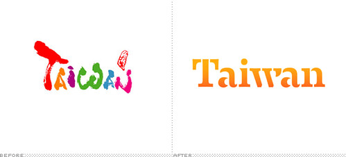
Image from Brand New
Then, the brush calligraphic strokes change to a newly created typeface. It seems to be lack of energy and becomes another western brand. The blended orange color might want to imply the warmth. But the former color is much easier to show the variety of Taiwan. Furthermore, the whole logo can’t strongly feel the meaning of the slogan “Taiwan - The Heart of Asia.”
Wally Olins said in Branding the Nation - the historical context,
Finally, this is a clip by D1 Production from Malaysia. You can see the beauty of Taiwan from a foreigner and testify the new logo is good or not.
From the press release on Taiwan Tourism Bureau,
Tourism will become a vehicle for driving the development of a variety of new industries such as health care, agriculture, and green industries, giving them a channel for transforming their resources into tourism products.Therefore, the Taiwan Tourism Bureau introduced a new identity designed by London-based Winkreative in 2011. According to the article on the official website,
The new “Taiwan – The Heart of Asia” logo is succinct, and consists of a newly created typeface. It represents the sincerity and innovation of Taiwan’s communications with the world. Taiwan is a fusion of tradition with new trends. Its special characteristics and diversity present what is precisely a microcosm of Asia. Asia’s heart and Taiwan’s warmth are what Taiwan tourism wants to offer tourists from around the world.
Image from Brand New
Then, the brush calligraphic strokes change to a newly created typeface. It seems to be lack of energy and becomes another western brand. The blended orange color might want to imply the warmth. But the former color is much easier to show the variety of Taiwan. Furthermore, the whole logo can’t strongly feel the meaning of the slogan “Taiwan - The Heart of Asia.”
Wally Olins said in Branding the Nation - the historical context,
Rebranding is OK for a corporation but not for a nation. In other words corporations change, merge, divest, invest and rebrand and reinvent themselves but nations don’t change, they are immutable. Their verities are eternal.In my opinion, it doesn’t mean rebranding a nation is forbidden. When the brand connects with nation, it must be careful to manipulate this image. Because it attaches with the culture. In addition, the former logo was promoted for ten years. The impression was already built on every tourist’s mind.
Finally, this is a clip by D1 Production from Malaysia. You can see the beauty of Taiwan from a foreigner and testify the new logo is good or not.
沒有留言:
張貼留言