顯示具有 Branding 標籤的文章。 顯示所有文章

2011/04/01

Brand Nickname

The word “brand” is derived from the Old Norse brandr meaning “to burn.” In order to identify, the owner make an animal with unique symbol at a later date. Nowadays, brand presents the reputation of a company. Furthermore, it has developed a relationship between the audience and corporation. Brand can show social status and personality. In fact, it already integrates into our normal life. For instance, the situation can be seen on the short film “Logorama." People also try to give the nickname for a company. It could be referred to the original name or the product. For instance, the Volkswagen Beetle is called “bug” or “buggy.”

According to Kevin Roberts said on the book “Lovemarks”,
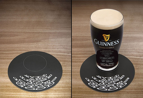
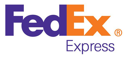
They forget all about the intimate dimension of relationships. They loved Customer Relationship Management. They honed their skills assessing the benefits from sponsorships, entertainment partnerships, and al l the other "ships." But if you attempted to get up close ...they dashed to the other side of the boardroom table. They ignored the power of Intimacy. They neglected to look at the intimate responses that illuminate the great Lovemarks.
Therefore, it is not a bad thing for the corporation. When someone gives you a nickname, it means they want to have an affiliation with you. Then, the audience does the same thing to their favorite brands. The company also redesigned logos in order to adopt nicknames. For instance, “FedEx” comes from Federal Express.

Brand Nickname_1

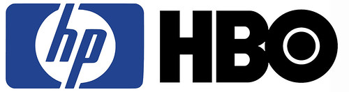
Many companies don’t only change their name for the intimacy. Additionally, the nickname is easy to keep in mind. It usually uses the initials for substitution, such as HP, HBO, P&G and AT&T.

Brand Nickname_2
Brand Nickname_3

There is a quotation below by William Bernbach.
Nobody counts the number of ads you run;
they just remember the impression you make.
In the same way, the audience will not remember the full name of company at first sight. If the company uses the nickname, the state of affairs will be different. Therefore, the audiences are very important for a company. They reflect the problems and help the corporation adjust for a better condition.

Further information:
You Took My Name by DOROTHY - Can you name all the brands?

2011/03/18

The Future

The future_1

How many compositions can one logo have? There are 40,000 logo shapes in 12 different color combinations for MIT Media Lab's New Logo. In order to celebrate the 25th anniversary, two Brooklyn-based designers, E Roon Kang and Richard The, created an innovative logo for MIT Media Lab.

From the article on Co.design
The basic idea here is that the logo has three intersecting spotlights that can be organized in any of 40,000 shapes and 12 color combinations using a custom algorithm. The spotlights tip a hat to the Media Lab’s rakish spirit of cross-pollination, with each spotlight symbolizing a single individual.

MIT Media Lab Identity, 2011 from readyletsgo on Vimeo.

The algorithmic design produces a unique logo for every teacher, staff member and student. In addition, it can give each new student a fresh logo for the next 25 years. The logo is just like the social security number.

Furthermore, Stefan Sagmeister created the logo of Casa da Musica in 2007. The Casa da Musica, a concert hall in Portugal, was built by Rem Koolhaas in 2005. Stefan Sagmeister used every aspect of the architecture as its corporate identity. In addition, his friend invented the software to make the logo flexible.

The future_3

According to Stefan Sagmeister talked on TED,
The Casa da Musica logo generator which scans any image and transfers the colours of this image onto the logo to create an individual colour logo version that has the same colour information as the given image. So the logo changes constantly its colour spectrum to present certain events or people of the Casa da Musica.
The future_3

In this way, every event in Casa da Musica can have their special poster. Furthermore, the logo can really incorporate with different kinds of media. For instance, the logo can grow under the skin.

The future_4

In fact, these two logos all based on a big frame and created an individual identity. MIT Media Lab's Logo shows a large number of arrangements by changing the color and position. Additionally, the Casa da Musica logo has more variations on the texture. The frame presents the corporate and brand value has different meaning.

It changed the former way of thinking in branding. The logos really become a part of their audience. In this way, the brand will effectively have an emotional relationship with their audience. Applying new media and technology creates an innovative prospect for the future. Although the concepts are just a beginning now, I still can see the unlimited possibility from these logos.

Further information:
Pentagram's Luke Hayman on How Multimedia Is Transforming Branding

2011/03/11

Taiwan Tourism New logo

Taiwan, a lovely place, has different kinds of food and friendly people. It contains enriched cultural and recreational activities. In the 16th century the Portuguese vessels at sea through Taiwan, the sailor saw Taiwan from the sea and shouted "Ilha Formosa!” It means “Beautiful Island”. Taiwan is a small island situated in East Asia in the Western Pacific Ocean and located off the southeastern coast of mainland China. It has the advantage of location for the travelers. Taiwan reportedly had 5 million visitors last year.

From the press release on Taiwan Tourism Bureau,
Tourism will become a vehicle for driving the development of a variety of new industries such as health care, agriculture, and green industries, giving them a channel for transforming their resources into tourism products.
Therefore, the Taiwan Tourism Bureau introduced a new identity designed by London-based Winkreative in 2011. According to the article on the official website,
The new “Taiwan – The Heart of Asia” logo is succinct, and consists of a newly created typeface. It represents the sincerity and innovation of Taiwan’s communications with the world. Taiwan is a fusion of tradition with new trends. Its special characteristics and diversity present what is precisely a microcosm of Asia. Asia’s heart and Taiwan’s warmth are what Taiwan tourism wants to offer tourists from around the world.
Taiwan Tourism New logo_1
Image from Brand New

Then, the brush calligraphic strokes change to a newly created typeface. It seems to be lack of energy and becomes another western brand. The blended orange color might want to imply the warmth. But the former color is much easier to show the variety of Taiwan. Furthermore, the whole logo can’t strongly feel the meaning of the slogan “Taiwan - The Heart of Asia.”

Wally Olins said in Branding the Nation - the historical context,
Rebranding is OK for a corporation but not for a nation. In other words corporations change, merge, divest, invest and rebrand and reinvent themselves but nations don’t change, they are immutable. Their verities are eternal.
In my opinion, it doesn’t mean rebranding a nation is forbidden. When the brand connects with nation, it must be careful to manipulate this image. Because it attaches with the culture. In addition, the former logo was promoted for ten years. The impression was already built on every tourist’s mind.

Finally, this is a clip by D1 Production from Malaysia. You can see the beauty of Taiwan from a foreigner and testify the new logo is good or not.

PassionRepublic Taiwan Trip from D1 PRODUCTION on Vimeo.

2011/02/18

A Small Idea in Big Scale

A small idea in big scale_1

Every year in January, the Annual Meeting of the World Economic Forum holds in Davos-Klosters which is best known to the world at large simply as "Davos". There are many leaders in the world participate this important event. On the security check-in area of the main event , there is a new installation worked by The Partners.

The concept is based on the client, Deloitte. From the statement on the article, World Anamorphic Branding,
Titled ‘A new perspective can change everything’ a Deloitte message ‘Stay a step ahead’ was woven into a broader story, encapsulating the forward thinking ambition of Davos and the World Economic Forum as an organisation.
When you go through this pathway, you can see the change of typeface from the beginning and feel different atmosphere. The brand shows the interaction with their audience. They use the anamorphic expression to connect the whole space. This is a small idea in big scale. According to Russ's talking,
What was it like creating a 440m² anamorphic installation your client and prime minister would be walking through? Alas to say it was pretty interesting.

Davos anamorphic from The Partners on Vimeo.

Everyone has different perspectives to look at this world. If you change the angle of your view, a normal thing can be more attractive. This is the sculpture made by Ron Mueck. He never made life-size sculptures because it never seemed to be interesting. In this way, people will start to observe the detail of the sculptures.

A small idea in big scale_2

Furthermore, the anamorphic art makes visual sense only when viewed from a particular angle or with the use of a viewing device such as a mirror.

A small idea in big scale_3